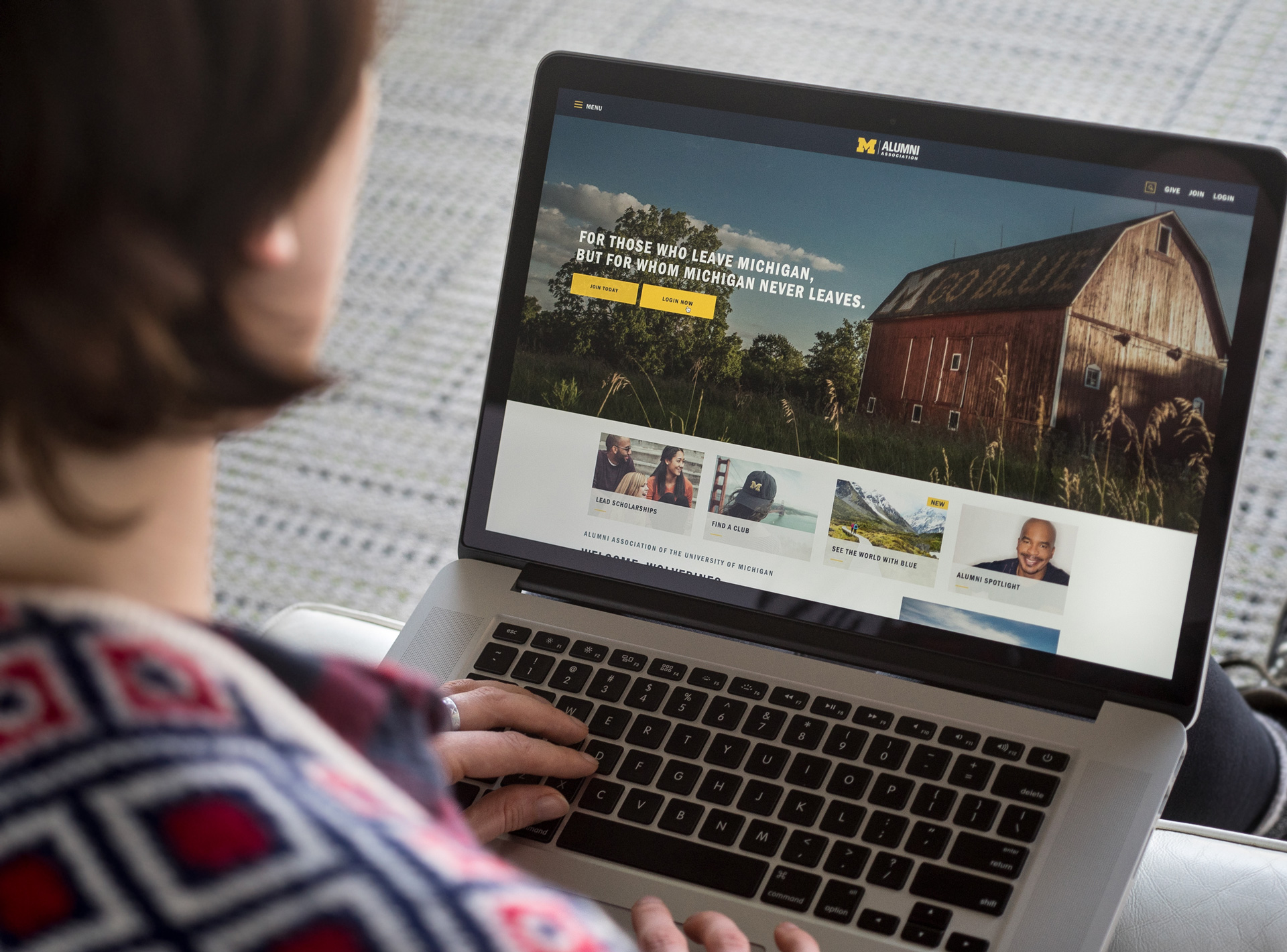
Alumni from the University of Michigan are a smart bunch. What the Alumni Association needed was a website to match. Enter the minds of Pitch Black (also a pretty smart bunch). We did our homework, immersing ourselves in that U-M mindset to deliver a responsive, intelligent experience worthy of the Wolverine user.

When we teamed up with the Alumni Association, they were in the midst of a total rebrand–an exciting and perfect time for redesigning a website. Visually, we were wiping the slate clean, creating a premium look and feel that would be reflective of the new vision of the organization, and those who bleed the Maize and Blue. At it’s core, we designed it with mobile in mind first, keeping things simple and intuitive, yet one that allowed for rich, relevant content and storytelling.

When we teamed up with the Alumni Association, they were in the midst of a total rebrand–an exciting and perfect time for redesigning a website. Visually, we were wiping the slate clean, creating a premium look and feel that would be reflective of the new vision of the organization, and those who bleed the Maize and Blue. At it’s core, we designed it with mobile in mind first, keeping things simple and intuitive, yet one that allowed for rich, relevant content and storytelling.
You can’t design a website for a U-M institution without incorporating Maize and Blue (unless you had some Ohio State in you). It’s ingrained in the brand, and a dominant thread that runs throughout the site. Variations of those colors are used in complimentary ways and are included in various design cues.

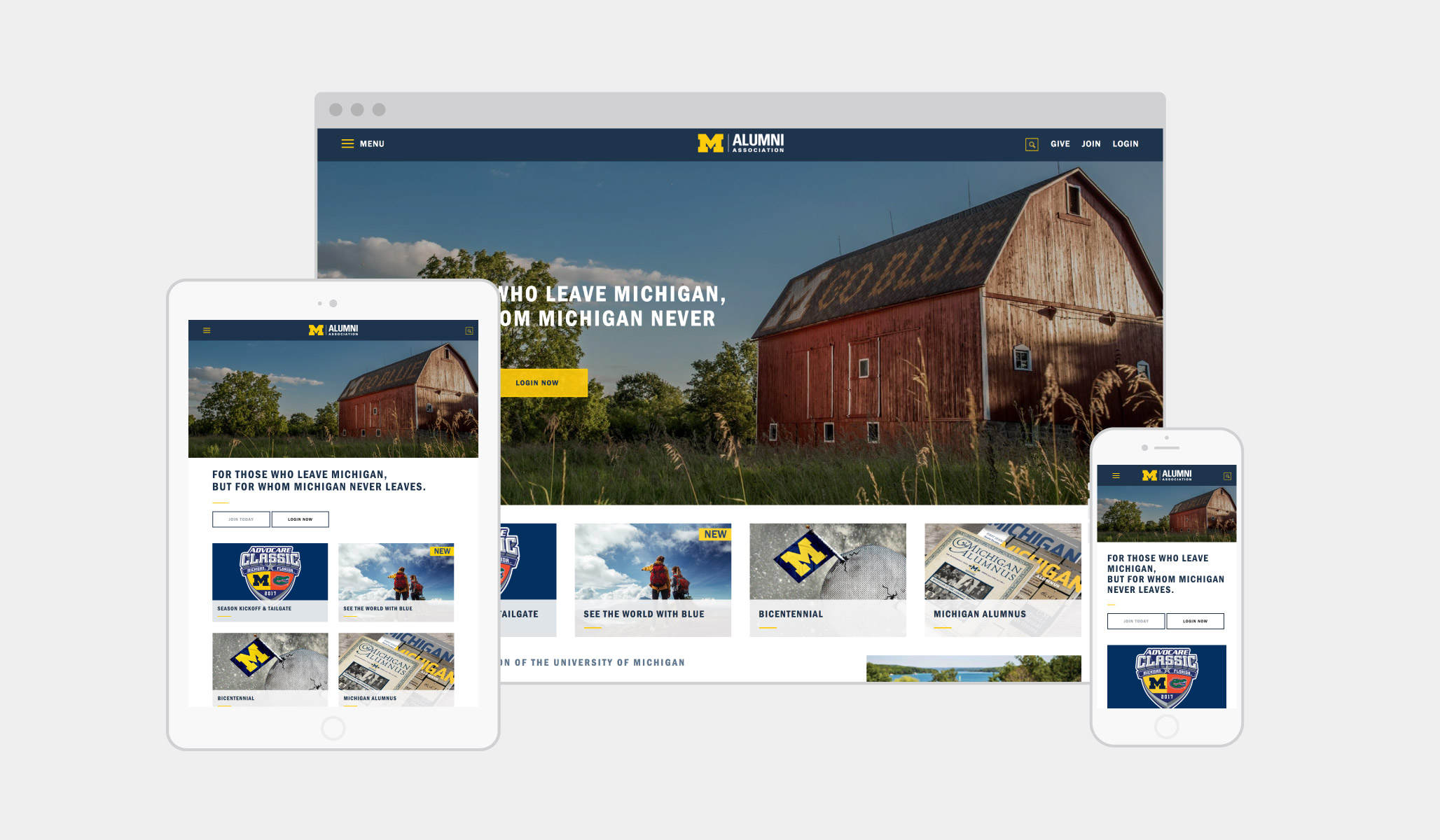
There are almost as many types of electronic devices as there are U-M alumni. So it’s important that our website’s content adapt to what’s at the user’s fingertips. We wanted a mobile experience that felt more like an app; one that adapts to any screen by reorganizing itself for optimal user engagement.
With any organization that has as many facets and offerings as the Alumni Association, it’s important to take a mega-nav/breadcrumb approach to its design. There are hundreds and hundreds of pages that make up this site and easily getting to the exact info the user is looking for is imperative.
Being a visually-driven site, and one who’s photography would play a major role in shaping the brand, we brought a first-rate photographer to the table to help carry out the vision. From shooting the Association’s Camp Michigania to the Go Blue Tailgate to a New York Club event, we laid the groundwork for the art direction and photography style going forward.
One size does not fit all. We customized many components of the site to accommodate both user and client experience. For sections like Travel and Clubs, users can drill down to specific content, with code rendered on the client side so it’s easily filtered. Photo galleries were designed to progressively load photos to save user bandwidth. Customizable hero containers provide flexibility based on content, and presentation on various screens. Custom-coded titles and content cards with clear CTAs take user directly to destination

There’s a whole intricate behind-the-scenes aspect to a website this comprehensive. Whether it’s incorporating Salesforce, a member-based login feature or a live events feed, the secret is to make it invisibly perfect. We’ve also made sure to make it easy for our partner to add, subtract and modify content through wordpress/visual composer, SASS processor, and code that doesn’t repeat itself so a single change to, say, a word gets changed globally.
Before a site goes live, it has to go through rigorous testing to make sure it works. Every link has to send you to the correct spot; every SalesForce function has to integrate flawlessly; every page has to load the way it was intended. And, with BrowserSync, we’re able to pull up the site on multiple devices at the same time to test responsiveness. And that’s it. Almost. Once the site goes live, the work doesn’t end. We offer support to help enhance the experience and troubleshoot for as long as a partner needs it.